Synthetic biology becomes advanced computational biology when we stop modeling one well-mixed tube and start modeling how genetic circuits interact with space, growth, mechanics, and time.
That transition matters because many important biological phenomena are not only molecular.
They are also spatial.
Cells grow in colonies, tissues, channels, chambers, and gradients. Those physical settings create differences in growth rate, dilution, crowding, and signal exposure. A circuit that looks simple in a single-cell ordinary differential equation can produce rich multicellular behavior once it is embedded in a spatial setting.
This chapter is built around the paper Novel Tunable Spatio-Temporal Patterns From a Simple Genetic Oscillator Circuit and the accompanying SpatialOscillator repository from RudgeLab. The paper is a strong example of the kind of computational thinking synthetic biologists should learn:
connect a gene circuit to a physical environment
reduce a complicated simulation into a smaller explanatory model
use parameter scans to discover design rules
turn simulation outputs into interpretable summaries such as kymographs, wave speeds, and wavelengths
Our goal in this chapter is not to reproduce the full paper exactly.
Instead, we will do something more useful pedagogically:
understand the biological and modeling ideas behind the work
build a smaller educational model in Python
store outputs in tidy format
interpret spatial patterns through plots and parameter sweeps
extract general lessons for advanced computational biology
13.1 What makes this chapter different from earlier modeling chapters?
Earlier in the book we mostly modeled one variable, one circuit, or one well-mixed system.
Here we move into multi-scale reasoning.
The main idea from the paper is that a genetic oscillator does not operate in isolation. Its behavior changes because cells at different positions in a colony experience different growth conditions. Mechanical constraints produce a non-uniform growth profile, and because growth dilutes proteins, that spatial growth profile changes the effective dynamics of the repressilator.
That coupling produces visible spatial patterns.
This is the key conceptual move:
gene circuit dynamics set the oscillatory machinery
growth and mechanics change the local timescale of that machinery
space turns those local differences into patterns we can see
That is advanced computational biology in one sentence.
13.2 The biological story
The paper studies a repressilator-like oscillator in a growing colony. A repressilator is a three-node negative feedback loop in which each repressor inhibits the next one in the cycle. When tuned appropriately, the system oscillates.
In a spatially growing colony, not all cells grow at the same rate. Cells near the edge continue growing more rapidly, while cells deeper inside the colony become growth-limited. That difference matters because protein concentrations are affected not only by degradation but also by dilution during growth.
So even if the circuit topology is unchanged, the effective dynamics of the oscillator depend on position in the colony.
The paper shows that this simple idea is enough to produce tunable spatio-temporal patterns:
static rings when effective degradation is too low
traveling waves when degradation is sufficiently strong
longer wavelengths when maximal expression is higher
The important lesson is not only about the repressilator.
It is about workflow. The authors combine:
a physical picture of colony growth
an analytical approximation for growth and velocity
a simplified one-dimensional model
more detailed individual-based simulations
parameter scans and kymographs
That is exactly the kind of layered modeling approach synthetic biologists should learn.
13.3 Growth profiles are spatial data
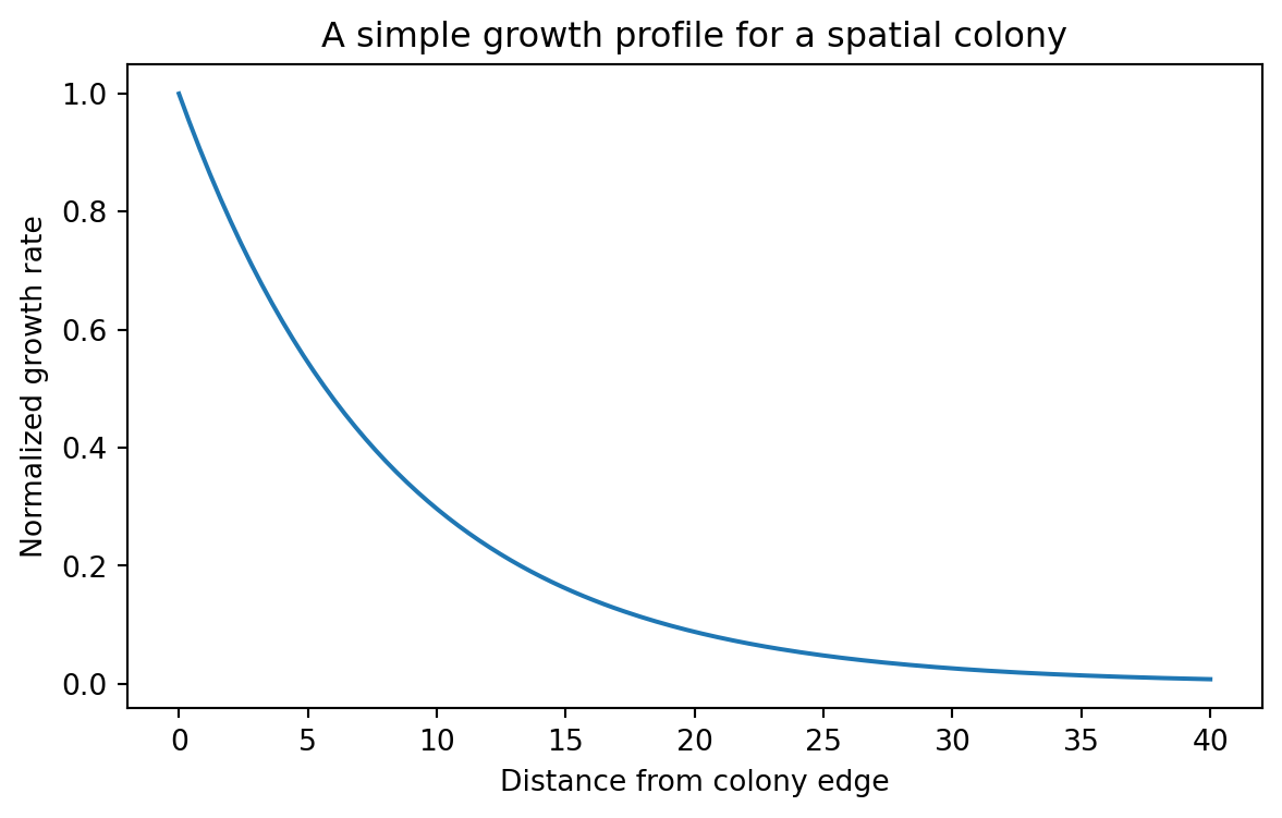
A central result of the paper is that growth rate decreases approximately exponentially with distance from the colony edge. Let us start there.
We will use a simple exponential growth profile:
[ (r) = _0 e^{-r/r_0} ]
where:
\mu(r) is the local growth rate
r is distance from the colony edge
\mu_0 is the maximal growth rate at the edge
r_0 is a characteristic decay length
This is already a useful computational biology lesson.
A spatial model often starts by replacing “space” with one carefully chosen coordinate. Here that coordinate is distance from the colony edge. That turns a messy two-dimensional biological problem into something we can reason about.
13.4 Building the growth profile in Python
import numpy as npimport pandas as pdimport matplotlib.pyplot as pltdef growth_rate_profile(distance_from_edge, r0=8.23, mu0=1.0):"""Exponential growth profile measured from the colony edge."""return mu0 * np.exp(-distance_from_edge / r0)distance = np.linspace(0, 40, 200)growth_rate = growth_rate_profile(distance)growth_df = pd.DataFrame( {"distance_from_edge": distance,"growth_rate": growth_rate,"profile": "colony_edge_decay", })growth_df.head()
distance_from_edge
growth_rate
profile
0
0.000000
1.000000
colony_edge_decay
1
0.201005
0.975872
colony_edge_decay
2
0.402010
0.952327
colony_edge_decay
3
0.603015
0.929350
colony_edge_decay
4
0.804020
0.906927
colony_edge_decay
This is a tidy table. Each row is one measurement at one distance for one profile.
That is the format we will keep using.
Even when we compute a whole spatial field or a whole simulation, we should always know how to convert it back into tidy tabular data.
13.5 Visualizing the growth profile
plt.figure(figsize=(7, 4))plt.plot(growth_df["distance_from_edge"], growth_df["growth_rate"])plt.xlabel("Distance from colony edge")plt.ylabel("Normalized growth rate")plt.title("A simple growth profile for a spatial colony")plt.show()
This curve captures an important biological asymmetry. Cells close to the edge grow quickly. Cells far from the edge grow slowly.
That means a circuit coupled to dilution or growth-dependent expression will not behave uniformly across the colony.
13.6 From growth profile to spatial phase differences
The full paper uses a reduced one-dimensional model plus more detailed individual-based simulations. Here we will build a smaller educational model that captures the same qualitative design logic.
The idea is simple.
We assume that each position in the colony hosts an oscillator, but that space introduces a phase lag because cells deeper in the colony experience less growth and therefore a different effective timescale.
We also let the temporal oscillation rate depend on a degradation-like parameter gamma.
This is not the full repressilator model. It is a compact teaching model that helps us reason about:
why static rings can appear
why traveling waves can appear
why one parameter mostly changes temporal behavior
why another mostly changes spatial spacing
That is often how advanced modeling works in practice. You first build a complex model to understand the mechanism, then build a smaller one to explain the mechanism.
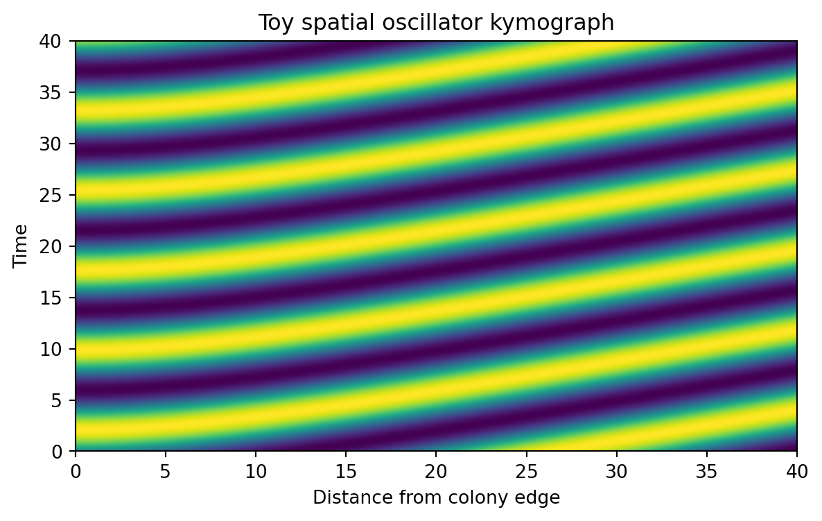
13.7 A toy spatial oscillator
We will encode two design ideas inspired by the paper.
First, stronger degradation should make the pattern evolve faster in time.
Second, stronger maximal expression should produce a longer spatial wavelength.
We translate those ideas into a reduced phase model.
def spatial_phase_profile(distance_from_edge, alpha=1e4, r0=8.23):""" Build a spatial phase lag from the cumulative growth deficit. Larger alpha gives longer spatial wavelength by reducing the rate at which phase changes across space. """ mu = growth_rate_profile(distance_from_edge, r0=r0) growth_deficit =1.0- mu cumulative_deficit = np.cumsum(growth_deficit) cumulative_deficit = cumulative_deficit / cumulative_deficit.max() alpha_scale =1/ (1+0.35* np.log10(alpha)) spatial_phase =2* np.pi *3.0* alpha_scale * cumulative_deficitreturn spatial_phasedef angular_frequency(gamma):"""Temporal oscillation rate used in the toy model."""if gamma <=0:return0.0return2* np.pi * (0.04+0.22* gamma)def simulate_toy_spatial_oscillator( alpha=1e4, gamma=0.4, r0=8.23, n_r=160, n_t=240, t_max=40,): distance = np.linspace(0, 40, n_r) time = np.linspace(0, t_max, n_t) mu = growth_rate_profile(distance, r0=r0) phase_space = spatial_phase_profile(distance, alpha=alpha, r0=r0) omega = angular_frequency(gamma) signal =0.5* (1+ np.sin(omega * time[:, None] - phase_space[None, :]))return {"time_h": time,"distance_from_edge": distance,"growth_rate": mu,"phase_space": phase_space,"omega": omega,"signal": signal,"alpha": alpha,"gamma": gamma, }simulation = simulate_toy_spatial_oscillator(alpha=1e4, gamma=0.4)simulation["signal"].shape
(240, 160)
Our signal is a matrix.
rows are time points
columns are spatial positions
values are normalized expression levels
This matrix is often called a kymograph array. A kymograph is one of the most useful visual tools in advanced computational biology, because it shows how a spatial profile changes over time.
13.8 Converting a kymograph into tidy data
Matrices are convenient for simulation. Tidy tables are better for analysis.
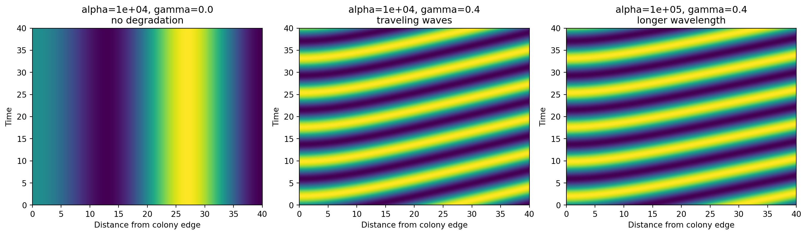
When gamma = 0, our toy model produces a static spatial pattern. The stripes do not move over time. That corresponds to the intuition behind the fixed-ring regime.
When gamma is positive, the pattern begins to move in time, creating traveling waves.
When we increase alpha, the stripes become more widely spaced in space. That corresponds to a longer wavelength.
Again, this is a reduced teaching model, not a literal recreation of every equation in the paper. But it captures the same computational design message: one parameter mainly changes temporal progression, while another mainly changes spatial spacing.
13.11 Extracting simple summaries from the toy model
Advanced computational biology is not only about generating beautiful simulations.
It is also about turning those simulations into quantitative summaries.
Let us extract two simple interpretable features:
an approximate spatial wavelength from the phase gradient
Each row is one simulation condition. That makes it easy to plot and compare.
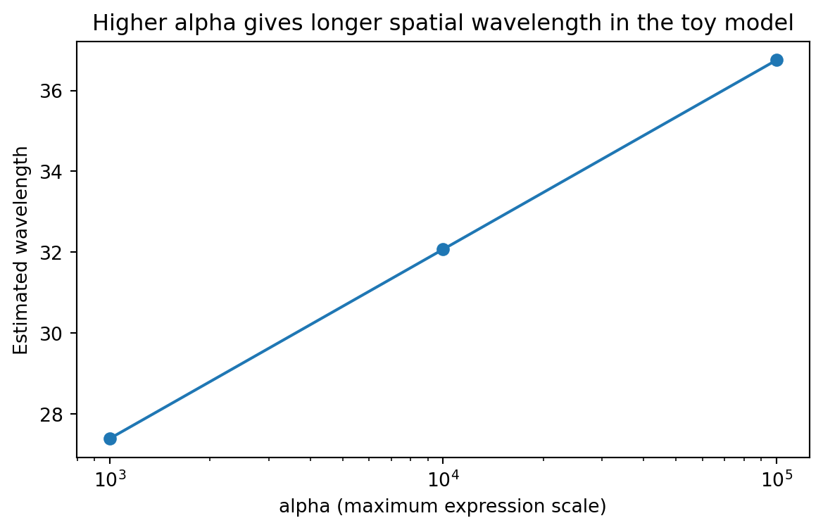
13.12 How maximal expression changes wavelength
wavelength_summary = ( scan_df.groupby("alpha", as_index=False)["estimated_wavelength"] .mean() .sort_values("alpha"))plt.figure(figsize=(7, 4))plt.plot(wavelength_summary["alpha"], wavelength_summary["estimated_wavelength"], marker="o")plt.xscale("log")plt.xlabel("alpha (maximum expression scale)")plt.ylabel("Estimated wavelength")plt.title("Higher alpha gives longer spatial wavelength in the toy model")plt.show()
This is the same type of question the paper asks, just in a much smaller model.
How does a biological design parameter change an interpretable spatial feature?
That is what parameter scans are for.
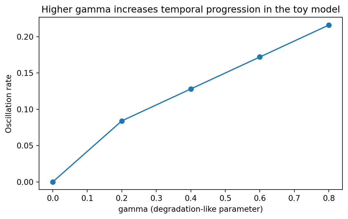
13.13 How degradation changes temporal progression
rate_summary = ( scan_df.groupby("gamma", as_index=False)["oscillation_rate"] .mean() .sort_values("gamma"))plt.figure(figsize=(7, 4))plt.plot(rate_summary["gamma"], rate_summary["oscillation_rate"], marker="o")plt.xlabel("gamma (degradation-like parameter)")plt.ylabel("Oscillation rate")plt.title("Higher gamma increases temporal progression in the toy model")plt.show()
This mirrors the central design rule from the paper.
A degradation-related parameter controls how fast the spatial pattern evolves.
13.14 Why kymographs are such a powerful representation
Kymographs deserve special attention because they show up often in advanced computational biology.
They are useful whenever you have:
a one-dimensional spatial coordinate plus time
a radial coordinate plus time
a moving front plus time
a sequence position plus cycle number
a lineage position plus time
In this chapter, the kymograph lets us compress a complicated spatial oscillator into a plot we can reason about visually.
That is part of the art of good computational biology.
Not every output should stay in raw array form. Sometimes the right representation is the thing that makes the mechanism obvious.
13.15 Thinking in layers: full model, reduced model, analysis pipeline
The real power of the paper is not just the repressilator result.
It is the layered modeling workflow.
13.15.1 Layer 1: a biological mechanism
The biological idea is that growth is non-uniform in space, and growth affects protein dilution.
13.15.2 Layer 2: a physical profile
The spatial setting generates a structured growth profile. In the paper this is linked to colony mechanics and physical constraints.
13.15.3 Layer 3: a reduced mathematical model
The authors derive a simplified one-dimensional model that captures how oscillator timing changes across the colony.
13.15.4 Layer 4: a richer computational model
The study also compares these ideas to more detailed individual-based simulations. That richer layer is where spatial mechanics and colony geometry become more realistic.
13.15.5 Layer 5: analysis outputs
The final interpretation happens through summaries such as:
growth profiles
kymographs
wave speed
wavelength
parameter scans
This is a very general pattern. It applies far beyond this specific paper.
13.16 What the repository teaches about computational workflow
The SpatialOscillator repository is also pedagogically useful. Its top-level structure separates models from analysis, which is a habit worth copying.
That separation is valuable because simulation and interpretation are different tasks.
model code generates states, trajectories, and raw outputs
analysis code computes summaries, makes figures, and compares conditions
When projects grow, mixing those layers becomes painful.
A good habit is:
simulate into raw arrays or files
convert results into tidy summaries
build figures from those tidy summaries
keep figure logic reproducible and separate from model logic
That is one of the most transferable lessons in this chapter.
13.17 A computational biologist’s checklist for spatial circuit models
When you move from simple gene expression models to spatial models, ask the following questions.
13.17.1 What is the spatial coordinate?
Is it:
radial distance from an edge?
absolute x-position in a channel?
a 2D grid location?
a graph or lineage coordinate?
Good models often begin by choosing the smallest coordinate that still captures the phenomenon.
13.17.2 What couples space to circuit dynamics?
Possibilities include:
dilution through growth
nutrient gradients
inducer gradients
diffusion of signals
mechanics and crowding
variable plasmid burden
In this chapter the coupling variable was growth.
13.17.3 What output representation makes the phenomenon interpretable?
Possibilities include:
line plots at fixed positions
snapshots in space
kymographs
phase diagrams
tidy parameter scans
Do not wait until the end to think about this. The right output format can shape the whole analysis pipeline.
13.17.4 Can you build a reduced model before the full model?
You usually should.
Reduced models help with:
intuition
debugging
parameter interpretation
teaching
identifying which mechanisms actually matter
13.18 A small extension: exporting tidy simulation summaries
A good chapter example should leave behind something reusable. Let us export our scan table.
Advanced computational biology benefits from saving derived summaries explicitly. Do not rely only on one notebook state or one figure. Save the tables that support your interpretation.
13.19 What this chapter does not capture
It is important to be honest about model scope.
Our toy model does not include:
the full repressilator ODE system
explicit mRNA and protein states for three repressors
individual-based mechanics
realistic colony geometry updates
stochastic cell-level variability
explicit microfluidic boundary conditions
That is okay.
The value of this chapter is that it teaches the computational logic behind the paper without forcing the reader to begin with a large simulation framework.
In research, both levels matter.
the detailed model is needed for realism and testing
the reduced model is needed for explanation and design intuition
13.20 Exercises
Change r0 in the growth profile and see how quickly growth decays away from the colony edge. What happens to the spatial phase profile?
Modify spatial_phase_profile() so that alpha has a stronger or weaker effect. How does that change the apparent wavelength?
Add a second signal and phase-shift it by 2π/3 to mimic another node in the repressilator. Plot the three signals at one spatial position.
Replace the exponential growth profile with a linear or logistic profile. Which features of the kymographs are robust, and which depend strongly on the chosen profile?
Build a channel version of this toy model by using one spatial axis x rather than distance from a colony edge.
Save the tidy kymograph table for one condition and compute the mean expression at each position over time.
13.21 Recap
This chapter introduced a different style of computational biology.
We moved from single-variable circuit models to a multi-scale way of thinking in which:
space matters
growth matters
mechanics matter
visual summaries matter
reduced models and detailed models support each other
The key biological lesson from the paper is that a simple genetic oscillator can generate rich multicellular patterns when coupled to a spatial growth profile.
The key computational lesson is even broader.
Advanced computational biology is often about choosing the right abstraction at the right level:
a physical profile simple enough to analyze
a reduced model simple enough to understand
a simulation rich enough to test the idea
an analysis representation simple enough to interpret
That is exactly the mindset synthetic biologists need when they begin designing systems that live not only in time, but also in space.