Synthetic biology is not only about storing data and drawing circuits.
It is also about asking quantitative questions.
How fast will a reporter accumulate?
What happens if a protein degrades more quickly?
How strongly does a promoter respond to an inducer?
Will two conditions separate cleanly, or overlap too much to be useful?
What parameters matter most?
Those are modeling questions.
A model is a simplified mathematical description of a biological system.
A good model does not capture everything. It captures the things that matter for the question we are asking.
In this chapter, we will build simple models of gene expression in Python.
Our goals are practical:
translate a biological story into equations
simulate those equations numerically
store simulated outputs in tidy data format
compare conditions and parameters systematically
build intuition for expression dynamics, not just algebra
This chapter is not a full course in dynamical systems.
It is a working introduction for synthetic biologists who want to think quantitatively and write code that supports that thinking.
Why model gene expression?
Experiments tell us what happened.
Models help us reason about what could happen.
That matters because synthetic biology often involves design choices before an experiment is run.
For example, you may want to compare:
a strong promoter vs a weak promoter
a stable protein vs a destabilized one
a low-copy plasmid vs a high-copy plasmid
a tightly repressed promoter vs a leaky promoter
a steep response curve vs a shallow one
A model lets us explore those alternatives quickly.
It does not replace experiments.
Instead, it helps with:
intuition building
experimental planning
parameter sensitivity analysis
identifying unrealistic expectations
communicating assumptions clearly
In synthetic biology, even simple models can be extremely useful.
Variables, parameters, and rates
A model usually contains three kinds of ingredients.
Variables
Variables change over time.
Examples:
mRNA concentration
protein concentration
inducer concentration
cell density
Parameters
Parameters are fixed for one simulation.
Examples:
transcription rate
translation rate
degradation rate
Hill coefficient
dissociation constant
Rules of change
Rules of change tell us how variables evolve.
For gene expression, a common idea is:
molecules are produced
molecules are removed or diluted
That is the core of many useful models.
The simplest expression model: production and loss
Let P be the amount of protein.
A minimal model says:
[ = - P ]
where:
\beta is the production rate\gamma is the loss rateP is the protein amount
The biological story is simple.
Protein is continuously produced, but it is also lost through degradation or dilution during growth.
This model already teaches something important.
At steady state, production and loss balance each other.
If:
[ = 0 ]
then:
[ P^* = ]
So the steady-state level depends on both production and loss.
A stronger promoter can increase expression, but so can a lower loss rate.
Computing the analytical solution
For the simple production-loss model, there is a closed-form solution.
If the initial amount is zero, then:
[ P(t) = (1 - e^{-t}) ]
Let us compute that in Python.
import numpy as npimport pandas as pdimport matplotlib.pyplot as plt= 4.0 = 0.5 = np.linspace(0 , 12 , 121 )= beta / gamma * (1 - np.exp(- gamma * time))= pd.DataFrame("time_h" : time,"species" : "protein" ,"value" : protein,"model" : "analytic" ,"condition" : "baseline" ,
0
0.0
protein
0.000000
analytic
baseline
1
0.1
protein
0.390165
analytic
baseline
2
0.2
protein
0.761301
analytic
baseline
3
0.3
protein
1.114336
analytic
baseline
4
0.4
protein
1.450154
analytic
baseline
This is a tidy time-course table .
Each row is one observation of one variable at one time under one condition.
That is the convention we will keep using.
Even simulated data should be stored in tidy format when possible.
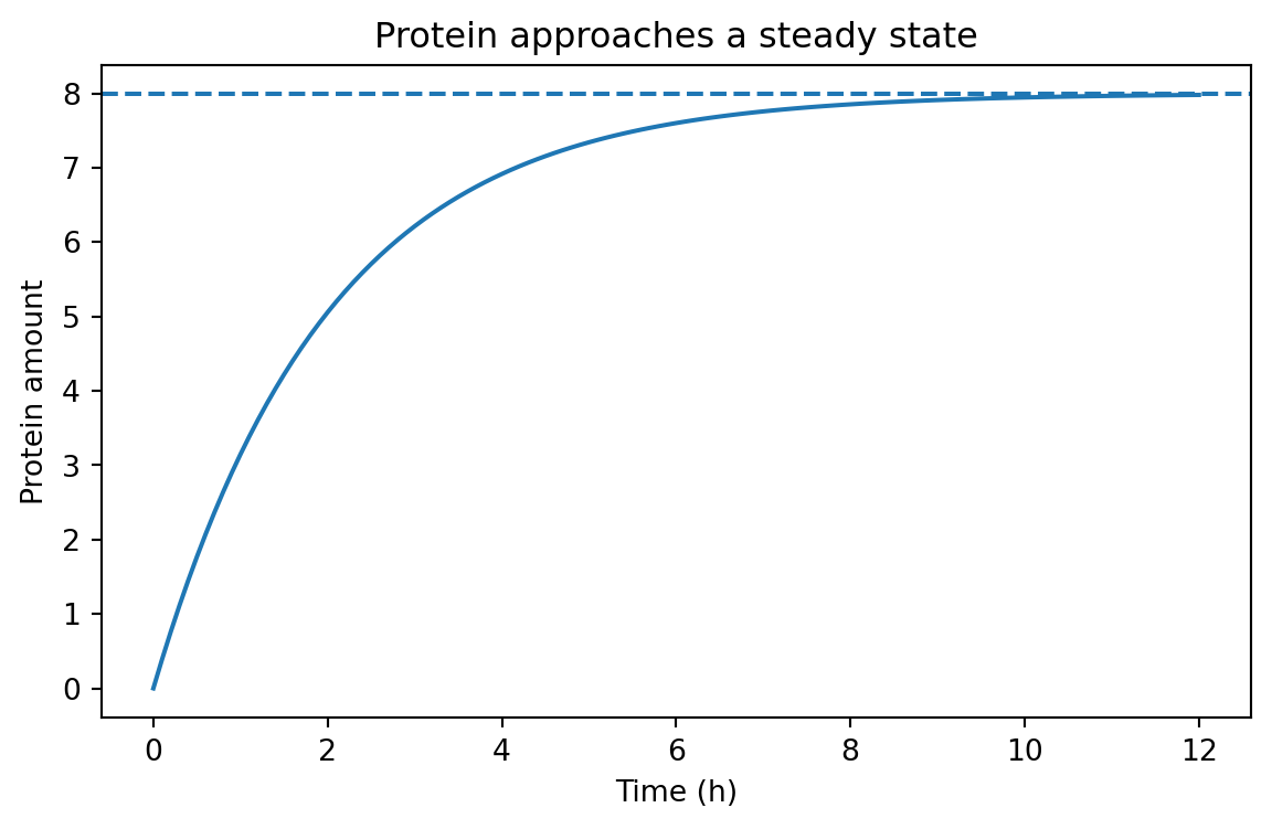
Visualizing the approach to steady state
= (7 , 4 ))"time_h" ], analytic_df["value" ])/ gamma, linestyle= "--" )"Time (h)" )"Protein amount" )"Protein approaches a steady state" )
The dashed line is the steady-state value \beta / \gamma.
The curve rises quickly at first, then slows as loss catches up to production.
That shape appears everywhere in biology.
Simulating the same model with Euler’s method
Many biological models do not have neat analytical solutions.
So we need a numerical method.
A very common first method is Euler’s method .
The idea is simple.
If the current state is P, and the rate of change is:
[ = f(P) ]
then over a small time step dt, we approximate:
[ P_{next} = P + dt f(P) ]
For our model:
[ P_{next} = P + dt(- P) ]
Let us implement that.
def simulate_protein(beta, gamma, t_end= 12 , dt= 0.1 , p0= 0.0 , condition= "baseline" ):= np.arange(0 , t_end + dt, dt)= p0= []for t in times:"time_h" : t,"species" : "protein" ,"value" : p,"condition" : condition,"model" : "euler" ,= beta - gamma * p= p + dt * dp_dtreturn pd.DataFrame(records)= simulate_protein(beta= 4.0 , gamma= 0.5 )
0
0.0
protein
0.00000
baseline
euler
1
0.1
protein
0.40000
baseline
euler
2
0.2
protein
0.78000
baseline
euler
3
0.3
protein
1.14100
baseline
euler
4
0.4
protein
1.48395
baseline
euler
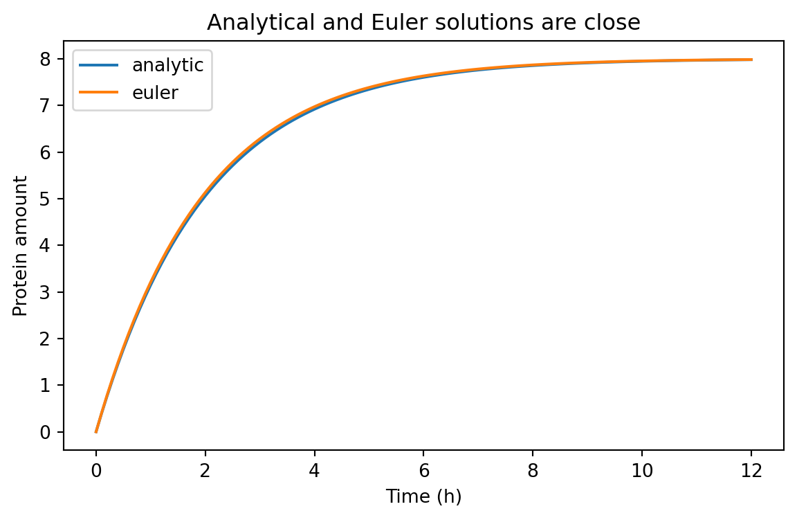
We can compare the numerical and analytical solutions.
= pd.concat([analytic_df, euler_df], ignore_index= True )
0
0.0
protein
0.000000
analytic
baseline
1
0.1
protein
0.390165
analytic
baseline
2
0.2
protein
0.761301
analytic
baseline
3
0.3
protein
1.114336
analytic
baseline
4
0.4
protein
1.450154
analytic
baseline
= (7 , 4 ))for model_name, subset in comparison_df.groupby("model" ):"time_h" ], subset["value" ], label= model_name)"Time (h)" )"Protein amount" )"Analytical and Euler solutions are close" )
For a small enough dt, Euler’s method does a good job here.
That is one of the first practical lessons of modeling:
the biology matters
the mathematics matters
the numerical method matters too
Time scales matter
The parameter \gamma controls how quickly the system responds.
If \gamma is large, the system adjusts quickly.
If \gamma is small, the system changes slowly.
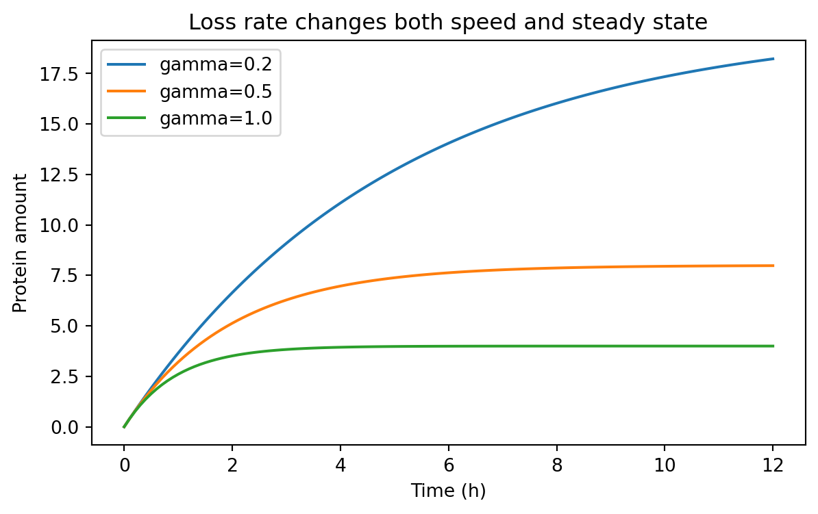
We can compare several degradation or dilution rates.
= pd.concat(= 4.0 , gamma= 0.2 , condition= "gamma=0.2" ),= 4.0 , gamma= 0.5 , condition= "gamma=0.5" ),= 4.0 , gamma= 1.0 , condition= "gamma=1.0" ),= True ,
0
0.0
protein
0.000000
gamma=0.2
euler
1
0.1
protein
0.400000
gamma=0.2
euler
2
0.2
protein
0.792000
gamma=0.2
euler
3
0.3
protein
1.176160
gamma=0.2
euler
4
0.4
protein
1.552637
gamma=0.2
euler
= (7 , 4 ))for condition, subset in rate_sweep.groupby("condition" ):"time_h" ], subset["value" ], label= condition)"Time (h)" )"Protein amount" )"Loss rate changes both speed and steady state" )
Notice what changed.
When \gamma increases:
the system responds faster
the steady-state level falls because \beta / \gamma becomes smaller
That is a powerful design idea.
Destabilizing a protein can make a system faster, but often at the cost of lower signal.
Building a tidy summary table
Because our simulations are already tidy, summarizing them is straightforward.
Let us extract the final simulated value for each condition.
= ("time_h" )"condition" , "species" ], as_index= False )1 )"condition" , "species" , "value" ]]= {"value" : "final_value" })= True )
0
gamma=1.0
protein
3.999987
1
gamma=0.5
protein
7.983021
2
gamma=0.2
protein
18.229243
This is exactly why tidy data is useful after Chapter 5.
We do not need a special case for simulated results.
We can filter, group, summarize, and merge them the same way we handled experimental data.
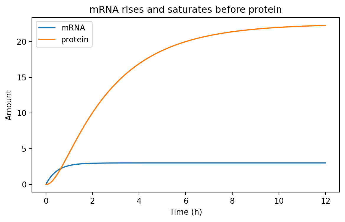
A two-stage model: mRNA and protein
The one-variable model is useful, but gene expression usually has at least two conceptual stages:
transcription produces mRNA
translation produces protein from mRNA
A simple two-stage model is:
[ = - _m m ]
[ = k_{tl} m - _p p ]
where:
m is mRNA amountp is protein amount\alpha is transcription rate\delta_m is mRNA loss ratek_{tl} is translation rate\delta_p is protein loss rate
This model helps us separate fast RNA dynamics from slower protein accumulation.
Simulating the two-stage model
def simulate_mrna_protein(= 12 ,= 0.05 ,= 0.0 ,= 0.0 ,= "baseline" ,= np.arange(0 , t_end + dt, dt)= m0= p0= []for t in times:"time_h" : t, "species" : "mRNA" , "value" : m, "condition" : condition})"time_h" : t, "species" : "protein" , "value" : p, "condition" : condition})= alpha - delta_m * m= k_tl * m - delta_p * p= m + dt * dm_dt= p + dt * dp_dtreturn pd.DataFrame(records)= simulate_mrna_protein(= 6.0 ,= 2.0 ,= 3.0 ,= 0.4 ,
0
0.00
mRNA
0.00
baseline
1
0.00
protein
0.00
baseline
2
0.05
mRNA
0.30
baseline
3
0.05
protein
0.00
baseline
4
0.10
mRNA
0.57
baseline
Again, this is tidy data.
Each row contains:
one time point
one species
one value
one condition
That structure is flexible enough for plotting and analysis.
= (7 , 4 ))for species, subset in two_stage_df.groupby("species" ):"time_h" ], subset["value" ], label= species)"Time (h)" )"Amount" )"mRNA rises and saturates before protein" )
Typically, mRNA responds faster because its turnover is faster.
Protein often lags behind.
That delay matters when designing dynamic circuits.
Induction and Hill functions
So far, production has been constant.
But many synthetic biology systems are regulated.
A promoter may respond to an inducer, a repressor, or an activator.
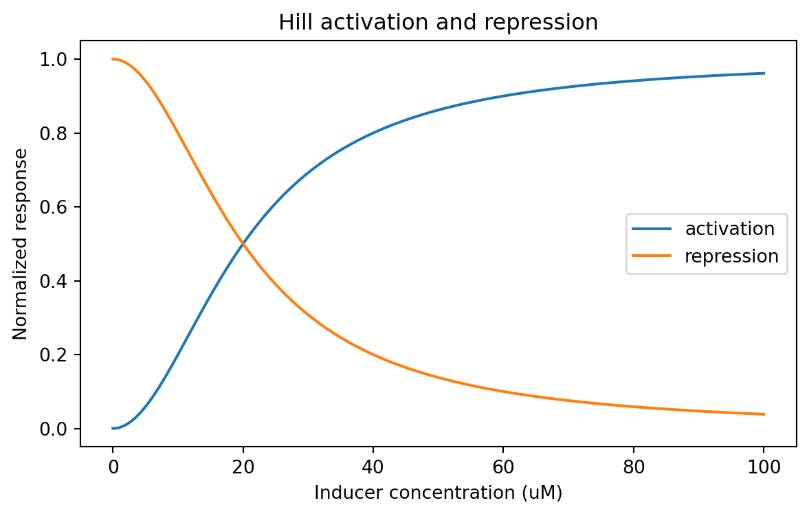
A common approximation is the Hill function .
Activation
A simple activation function is:
[ (x) = ]
where:
x is inducer or activator concentrationK is the half-response concentrationn is the Hill coefficient
Repression
A simple repression function is:
[ (x) = ]
These functions are not perfect descriptions of every promoter.
But they are extremely useful approximations.
Coding Hill functions
def hill_activation(x, K, n):= np.asarray(x, dtype= float )return (x** n) / (K** n + x** n)def hill_repression(x, K, n):= np.asarray(x, dtype= float )return (K** n) / (K** n + x** n)= np.linspace(0 , 100 , 201 )= hill_activation(inducer, K= 20 , n= 2 )= hill_repression(inducer, K= 20 , n= 2 )= pd.DataFrame("inducer_uM" : np.concatenate([inducer, inducer]),"response" : np.concatenate([activation, repression]),"relationship" : ["activation" ] * len (inducer) + ["repression" ] * len (inducer),
0
0.0
0.000000
activation
1
0.5
0.000625
activation
2
1.0
0.002494
activation
3
1.5
0.005594
activation
4
2.0
0.009901
activation
= (7 , 4 ))for relationship, subset in hill_df.groupby("relationship" ):"inducer_uM" ], subset["response" ], label= relationship)"Inducer concentration (uM)" )"Normalized response" )"Hill activation and repression" )
A Hill coefficient of n = 1 gives a gentler curve.
A larger n makes the response steeper.
That can matter a lot when designing threshold-like behavior.
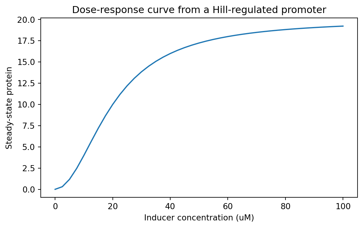
Linking induction to protein production
We can plug a Hill activation function into our expression model.
Suppose a promoter has a maximum transcription rate alpha_max, and induction controls what fraction of that maximum is active.
Then we might write:
[ (x) = _{max} ]
Let us compute a steady-state dose-response curve for protein.
In the simple production-loss model, steady state is P^* = \beta / \gamma.
If we treat \beta as an inducer-dependent production term, we can sweep across inducer values.
= 12.0 = 0.6 = np.linspace(0 , 100 , 41 )= []for x in inducer_values:= alpha_max * hill_activation(x, K= 20 , n= 2 )= beta_x / gamma"inducer_uM" : x,"steady_state_protein" : p_ss,"K" : 20 ,"hill_n" : 2 ,= pd.DataFrame(response_records)
0
0.0
0.000000
20
2
1
2.5
0.307692
20
2
2
5.0
1.176471
20
2
3
7.5
2.465753
20
2
4
10.0
4.000000
20
2
= (7 , 4 ))"inducer_uM" ], dose_response_df["steady_state_protein" ])"Inducer concentration (uM)" )"Steady-state protein" )"Dose-response curve from a Hill-regulated promoter" )
This is a classic synthetic biology use case.
You can think of the model as a way to connect:
inducer concentration
promoter activity
expression level
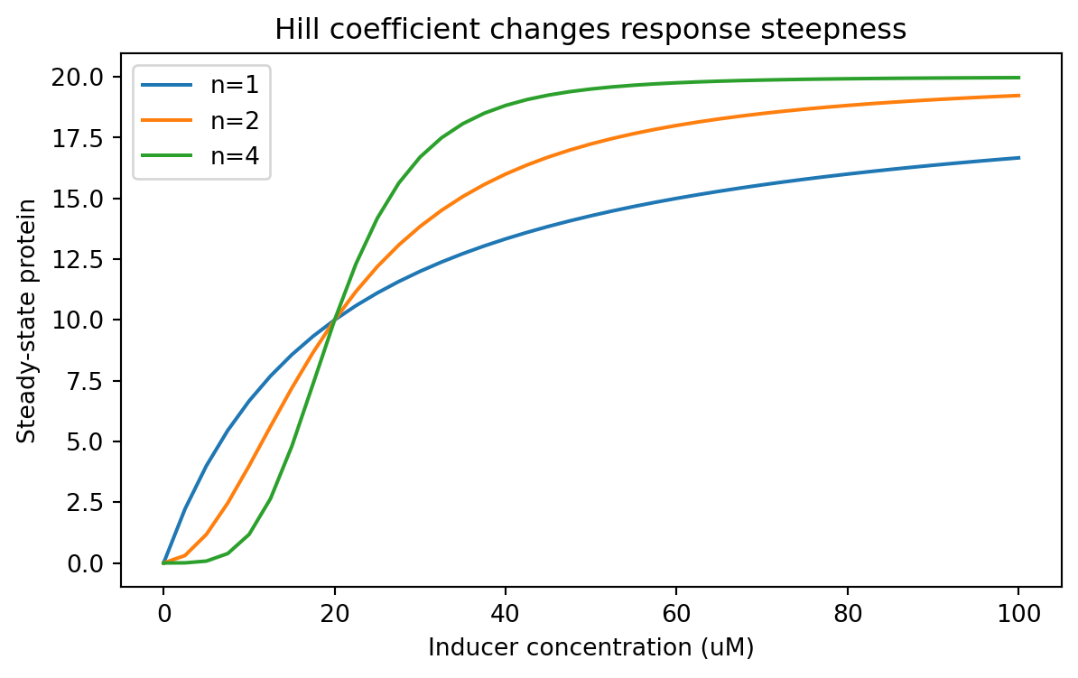
Parameter sweeps should also be tidy
From this point onward, parameter sweeps should be stored tidily too.
Let us compare different Hill coefficients.
= []for n_value in [1 , 2 , 4 ]:for x in inducer_values:= alpha_max * hill_activation(x, K= 20 , n= n_value)= beta_x / gamma"inducer_uM" : x,"steady_state_protein" : p_ss,"hill_n" : n_value,"K" : 20 ,"parameter" : "hill_n" ,= pd.DataFrame(parameter_sweep_records)
0
0.0
0.000000
1
20
hill_n
1
2.5
2.222222
1
20
hill_n
2
5.0
4.000000
1
20
hill_n
3
7.5
5.454545
1
20
hill_n
4
10.0
6.666667
1
20
hill_n
= (7 , 4 ))for hill_n, subset in parameter_sweep_df.groupby("hill_n" ):"inducer_uM" ], subset["steady_state_protein" ], label= f"n= { hill_n} " )"Inducer concentration (uM)" )"Steady-state protein" )"Hill coefficient changes response steepness" )
Now the sweep lives in a tidy table, so we can summarize it easily.
For example, what inducer concentration first reaches at least half-maximal output?
= []= parameter_sweep_df["steady_state_protein" ].max ()for hill_n, subset in parameter_sweep_df.groupby("hill_n" ):= subset["steady_state_protein" ].max () / 2 = subset[subset["steady_state_protein" ] >= threshold]= above["inducer_uM" ].min ()"hill_n" : hill_n, "half_max_inducer_uM" : first_crossing})= pd.DataFrame(half_max_summary)
0
1
15.0
1
2
20.0
2
4
20.0
Simulating an induction time course
A dose-response curve tells us steady-state behavior.
But sometimes we care about dynamics after induction.
We can simulate a protein model where the production rate depends on inducer concentration.
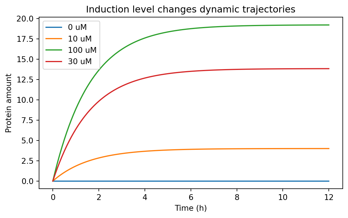
def simulate_induced_protein(inducer_uM, alpha_max, K, n, gamma, t_end= 12 , dt= 0.1 , condition= None ):if condition is None := f"inducer= { inducer_uM} " = alpha_max * hill_activation(inducer_uM, K= K, n= n)return simulate_protein(beta= beta, gamma= gamma, t_end= t_end, dt= dt, condition= condition)= pd.concat(0 , 12.0 , 20 , 2 , 0.6 , condition= "0 uM" ),10 , 12.0 , 20 , 2 , 0.6 , condition= "10 uM" ),30 , 12.0 , 20 , 2 , 0.6 , condition= "30 uM" ),100 , 12.0 , 20 , 2 , 0.6 , condition= "100 uM" ),= True ,
0
0.0
protein
0.0
0 uM
euler
1
0.1
protein
0.0
0 uM
euler
2
0.2
protein
0.0
0 uM
euler
3
0.3
protein
0.0
0 uM
euler
4
0.4
protein
0.0
0 uM
euler
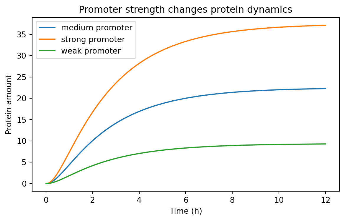
= (7 , 4 ))for condition, subset in induction_timecourse_df.groupby("condition" ):"time_h" ], subset["value" ], label= condition)"Time (h)" )"Protein amount" )"Induction level changes dynamic trajectories" )
This kind of result helps answer practical design questions.
For example:
is basal expression acceptably low?
does the induced state separate enough from the uninduced state?
how long must we wait before measuring fluorescence?
A note on deterministic vs stochastic models
Everything we have done so far is deterministic .
That means the model gives the same answer every time for the same parameters and initial conditions.
Real gene expression is often noisy.
At low copy number, stochastic effects can matter a lot.
So why start with deterministic models?
Because they are often the right first step.
They help us understand:
the average behavior
the role of parameters
the structure of a design
whether a system is even plausible before adding more realism
Later, you may want stochastic simulation, Bayesian inference, or parameter estimation from data.
But deterministic models are the right foundation.
Choosing the right level of model complexity
Not every project needs the same model.
A useful rule of thumb is:
start with the simplest model that can answer your question
add complexity only when the simpler model fails meaningfully
For example:
Use a one-variable production-loss model when you care about:
rough accumulation times
steady-state scaling
promoter strength comparisons
Use a two-stage mRNA-protein model when you care about:
transcription vs translation separately
delays between RNA and protein
RNA instability
Use regulated production with Hill functions when you care about:
induction curves
repression curves
threshold behavior
dose-response tuning
A model is not better because it has more equations.
A model is better when it is better matched to the question.
Exercises
Change the degradation rate gamma in the one-variable model and measure how long it takes to reach 90% of steady state.
Modify the two-stage model so that the initial mRNA amount is nonzero. How does that change early protein accumulation?
Compare two proteins with the same production rate but different degradation rates. Which one is faster? Which one reaches a higher steady state?
Repeat the Hill-function sweep with different values of K. How does K shift the response curve?
Build a tidy parameter sweep over both K and n, and summarize the final steady-state protein values.
Add a constant leak term to the induced production model and examine basal expression.
Save one of your simulated tidy tables to CSV for later analysis.
Recap
In this chapter, we introduced practical modeling of gene expression in Python.
The most important ideas are:
models turn biological stories into quantitative rules
production-loss models already explain steady states and response times
Euler’s method lets us simulate models numerically
simulated outputs should be stored in tidy data format just like experimental data
two-stage mRNA-protein models add biological realism while staying manageable
Hill functions are a practical way to model activation and repression
tidy parameter sweeps make it easy to compare design choices systematically
From this point onward, we will treat simulated tables the same way we treat experimental ones:
each row should represent one observation
variables should live in columns
conditions and parameters should be explicit
tidy data remains the default format for downstream analysis
That consistency is important.
It means the same Python tools can support both modeling and experiments, which is exactly what we want in synthetic biology.